
The Role of Color in Architecture: A Journey into the Psychology and Design Aspects
When we think about architecture, we often envision grand structures, innovative designs, and remarkable engineering feats. Yet, amidst the concrete, steel, and glass, there’s one element that plays a pivotal role in shaping our perception of architectural spaces – color. The use of color in architecture is a dynamic and intricate art that not only enhances aesthetics but also profoundly affects our psychological and emotional responses to the built environment. In this blog, we’ll embark on a journey into the world of color in architecture, exploring both the psychological and design aspects that make it a crucial consideration for architects and designers.
Color Psychology in Architecture:
The psychological impact of color is a phenomenon that has been studied extensively. Color can evoke emotions, trigger memories, and influence behavior. When applied judiciously in architectural design, it can transform a space into an experience. So, here’s a brief look at how different colors can affect us:
- Warm Colors:
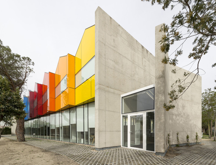
- Red: Red is passionate, energetic, and attention-grabbing. It can be used in architecture to create a sense of urgency or excitement. In smaller doses, it can add warmth and coziness to a space.
- Yellow: Yellow is associated with positivity and happiness. It can be used in spaces where creativity and optimism are encouraged, such as art studios or classrooms.
- Cool Colors:
- Blue: Blue is calming and serene. It’s often used in healthcare settings to promote a sense of tranquility. In residential spaces, it can create a peaceful atmosphere.
- Green: Green is associated with nature and growth. It’s a great choice for spaces where relaxation and rejuvenation are the goals, like spas or bedrooms.
- Neutrals:
- White: White signifies purity and simplicity. It can make a space feel clean, open, and timeless. However, too much white can be stark and clinical.
- Gray: Gray is versatile and can convey sophistication or neutrality, depending on its shade and context.
- Bold Colors:
- Purple: Purple is often associated with luxury and creativity. It can be used to add a sense of opulence to spaces like theaters or upscale boutiques.
- Orange: Orange is vibrant and energetic, making it suitable for spaces where activity and enthusiasm are encouraged, such as gyms or play areas.
Design Aspects of Color in Architecture:
Beyond psychology, color also plays a significant role in architectural design. Furthermore, here are some design considerations:
- Spatial Perception: Color can influence how we perceive space. Lighter colors tend to make rooms appear larger, while darker colors can create a cozier, more intimate atmosphere. Architects can manipulate the perceived size of a space by selecting appropriate colors.
- Identity and Branding: In commercial architecture, color can be used to reinforce a brand’s identity. Iconic colors like Coca-Cola’s red or Tiffany & Co.’s robin’s egg blue are instantly recognizable and create a strong brand association.
- Cultural Significance: Different cultures attach varying meanings to colors. Architects working on projects with a global reach must consider these cultural connotations. For instance, while white symbolizes purity in Western cultures, it represents mourning in some Asian cultures.
- Historical Context: Historical architecture often adheres to specific color palettes that reflect the period in which the building was constructed. When restoring or renovating historic structures, architects must pay homage to these color traditions.
- Environmental Considerations: Sustainable architecture considers the reflective properties of colors. Light-colored surfaces can help reduce heat absorption, making buildings more energy-efficient, particularly in hot climates.
- Visual Hierarchy: Color can be used to guide occupants through a space. Architects can employ contrasting colors to draw attention to key features or elements within a building.
In conclusion
Color is not merely a decorative element in architecture; it is a powerful tool that architects and designers use to create spaces that evoke specific emotions, convey meaning, and fulfill functional requirements. The careful selection and application of color can transform a building from a mere structure into a place that resonates with its inhabitants, leaving a lasting impression on all who experience it. Whether it’s the soothing blues of a healthcare facility or the bold reds of a retail store, color in architecture is a vibrant and essential facet of our built environment.